Website design for an English school
I designed a website for an English school with 150+ students. The main goal was to create a simple website for potential clients who want more information about the school.
Key Outcomes
- • A lot of time saved daily by the owner
- • Branding that immediately communicates the teaching style
- • Website is live at www.oldschoolhouse.pl
Key Takeaways
- • I learned a lot about collaboration with a client — when to say 'no' to certain ideas, how you have to set clear goals and how to balance client wishes with good practices
- • I practiced creating appropriate branding and running efficient user research
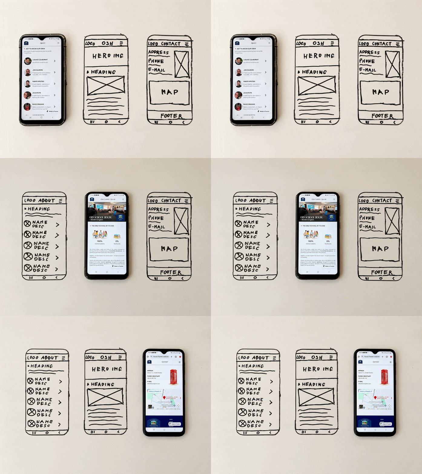
Role
UX Design
UX Research
Web Developer
Web Admin
Team
Solo
Timeline
3 months
Dec 2024 - Feb 2025
The Problem
It's tiresome to explain the same thing every day
Before this project, the school didn't have a website. That means the owner was forced to repeat the same information every time a new parent called to sign their kid up for a lesson. And that happens almost every day.
That's why we put special emphasis on clear branding, intuitive solutions and accessible key info.
The Solution
Simple design and clear branding
We do not care about impressing the visitor with excellent visual design and fancy animations. What we want them to take away is that this is the laid-back, home-like, conversation-first, English school with zero textbooks. And that's what we convey through branding and copy.
When a user enters the website, they know exactly what to expect from the school and the essential info is right where they expect it.
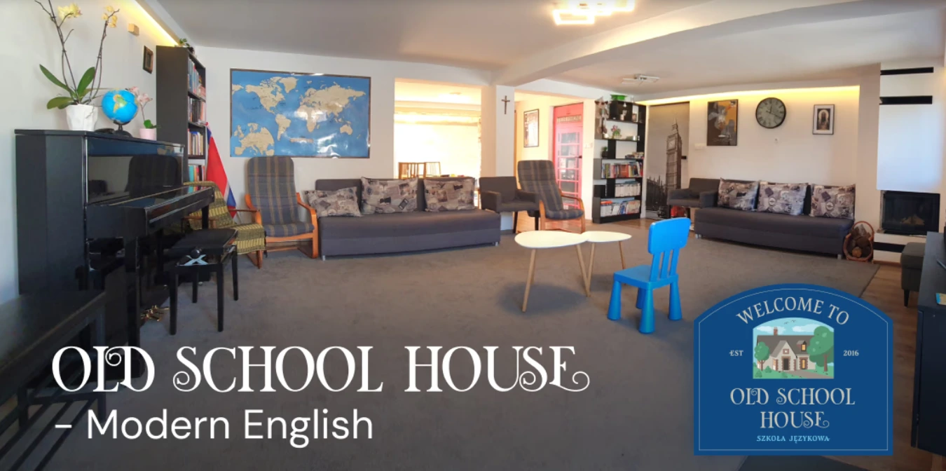
We are showing the home-like learning environment right away in the hero section -
research proved this was the right call
The Process
Discovery
I met with the client several times to gather key requirements, identify priorities and analyze competitor websites.
Exploration
We agreed on the layout, hero image and the color palette based on the Union Jack. For imagery we settled on colorful, hand-drawn illustrations, which were later replaced by AI illustrations due to inconsistencies.
Building
I got to work using Framer and created the website based on what we established earlier. We refined ideas and UI elements continuously.
Adjustments
The client thoroughly reviewed the website and gradually sent me his comments and ideas. We discussed them and we had to let go of some of them, as I explained they didn't serve any real purpose and would increase the user's cognitive load.
Validation
I conducted user research with two groups - potential clients and parents. The latter focused on teachers' backgrounds and payment info, while the younger demographic cared more about the teaching approach and overall aesthetics. As a result, we adjusted the way we present key info about payment and enrollment.
Visual Explorations
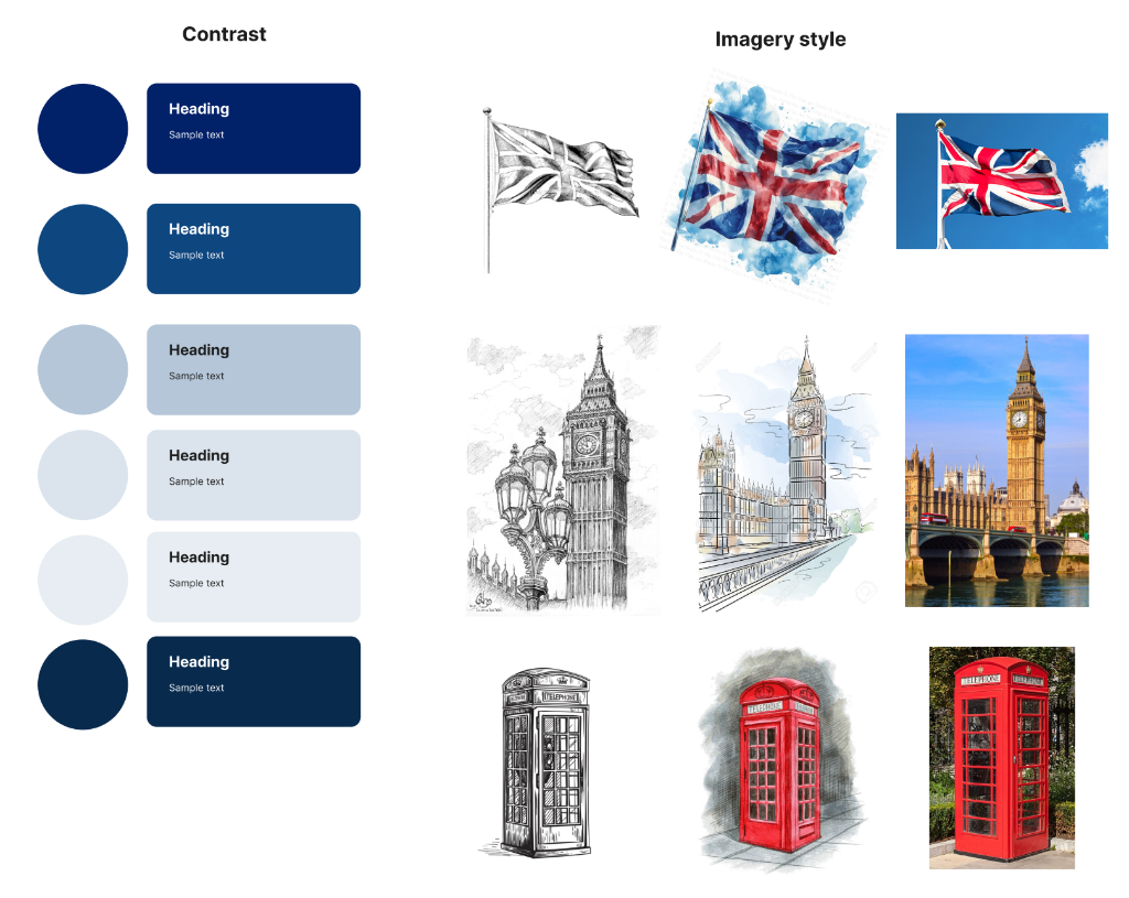
Exploring different imagery styles
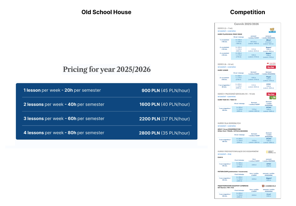
Our pricing complexity compared to that of a larger school
Fun Fact
I have strongly suggested that we create consistent photos for the teachers due to current pictures having different perspective, background, zoom and expression. This was confirmed in research, however the client decided to use the existing ones, as they are more casual and chaotic, similarly to the school's teaching philosophy.
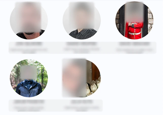
Compare the positions of faces and backgrounds between pictures
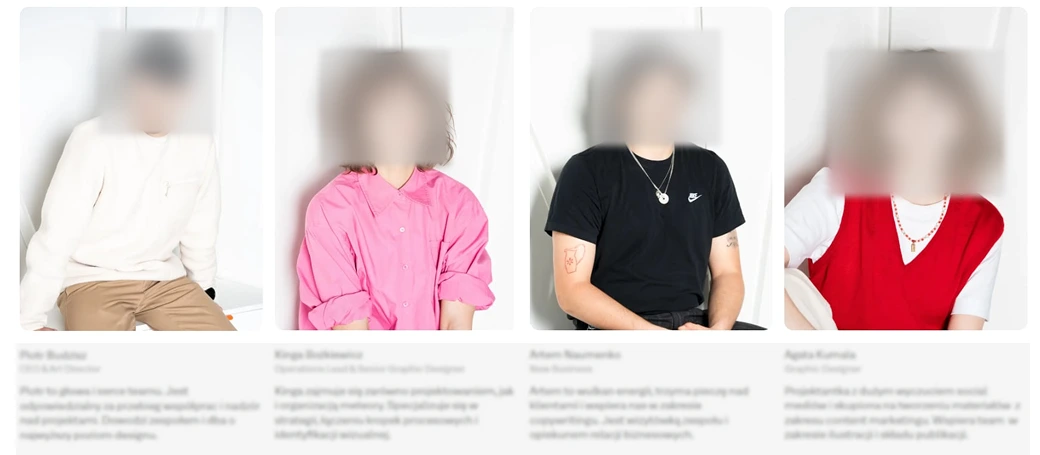
Some slight variations, but the images feel like they belong together

